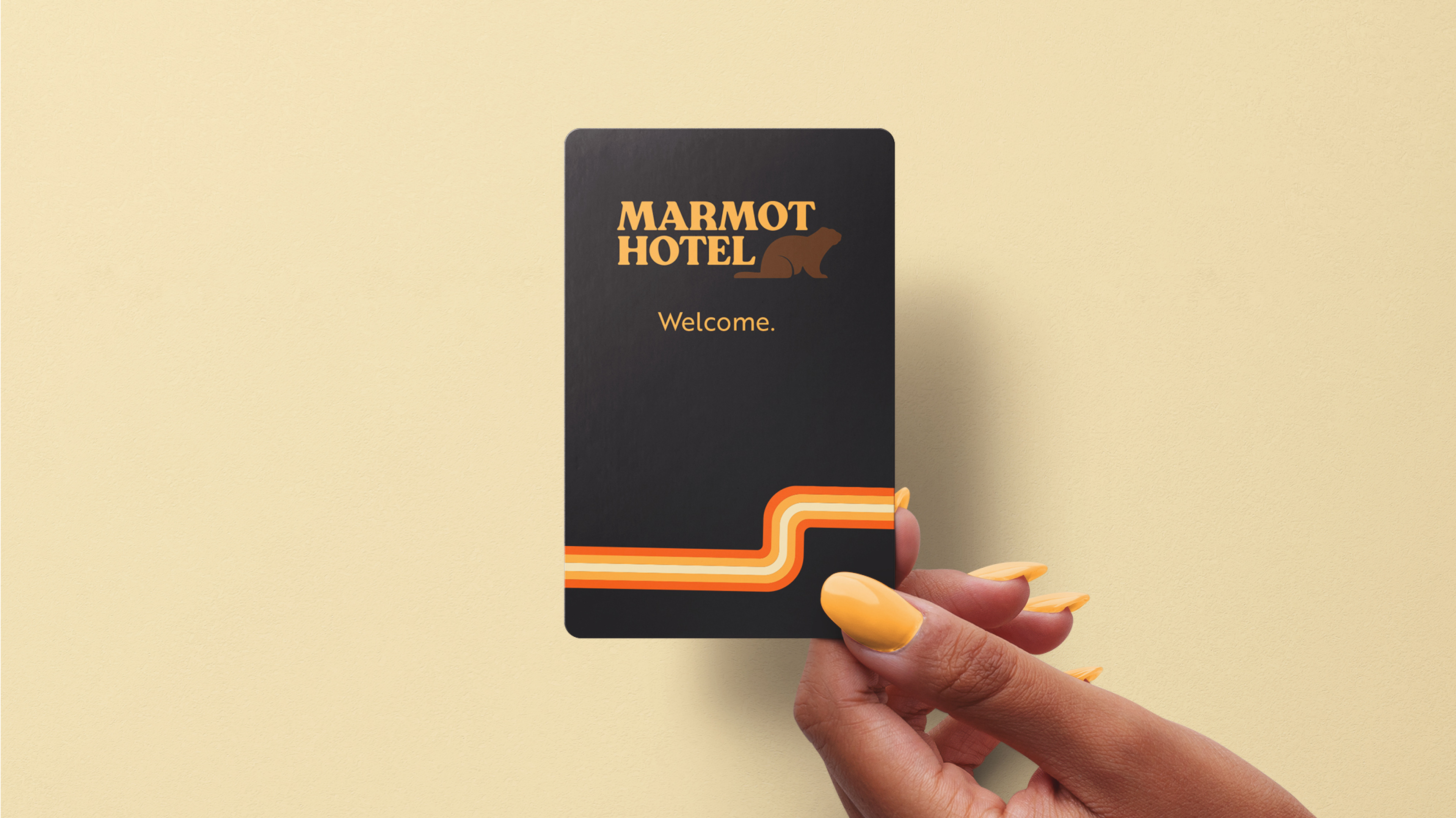
The Marmot Hotel is a bed and breakfast based in the Wyoming area right outside of Grand Teton National Park. The brand wants to provide a comforting and relaxing destination for anyone and everyone. The bed and breakfast has a classic and comfortable feeling mixed with a modern and clean aesthetic.
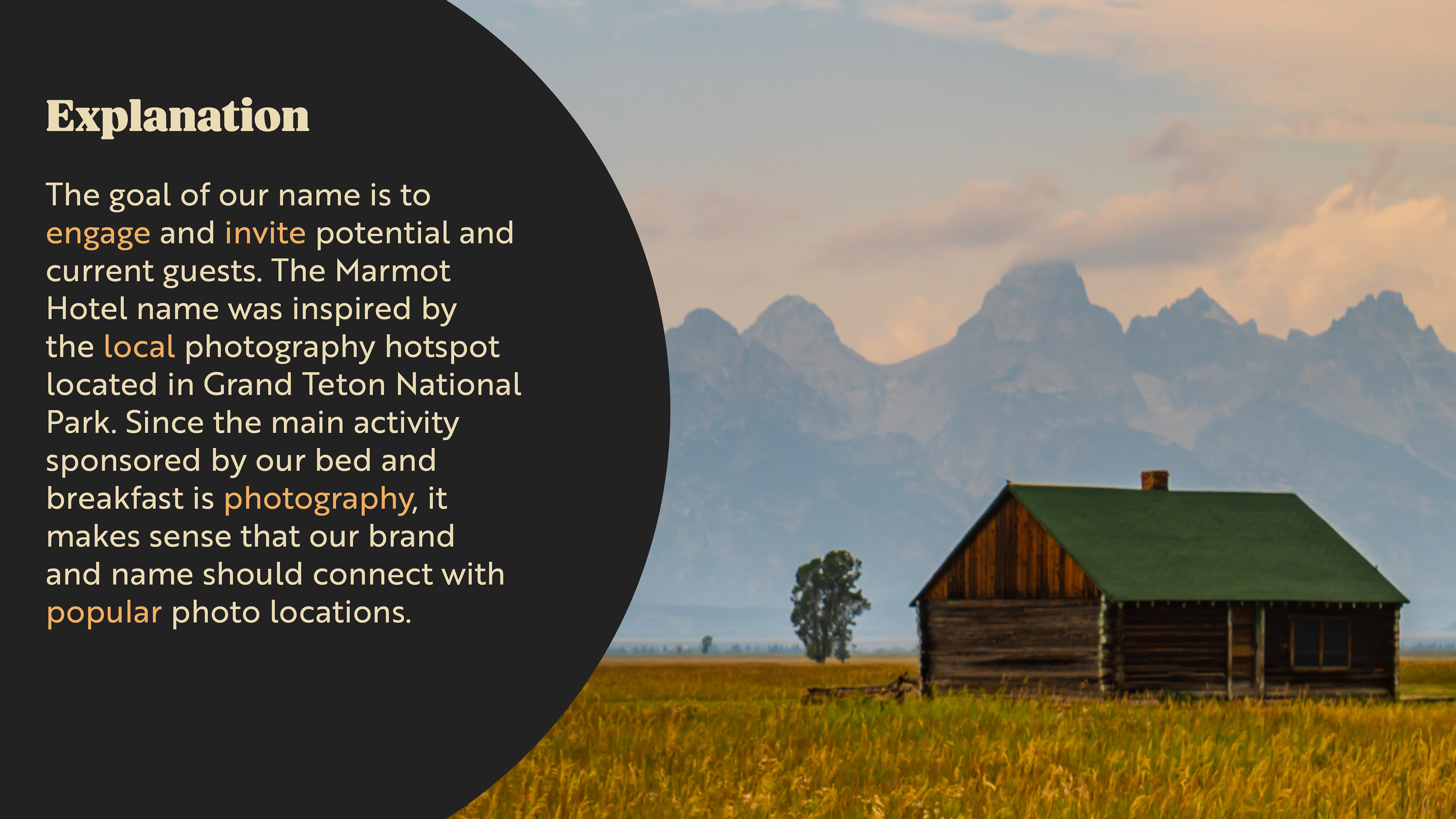
The name, the Marmot Hotel, was chosen because it connects with local photography hotspots and engages potential guests. The name is unique, playful, and perfectly connects the client's bed and breakfast with the surrounding Grand Teton area.
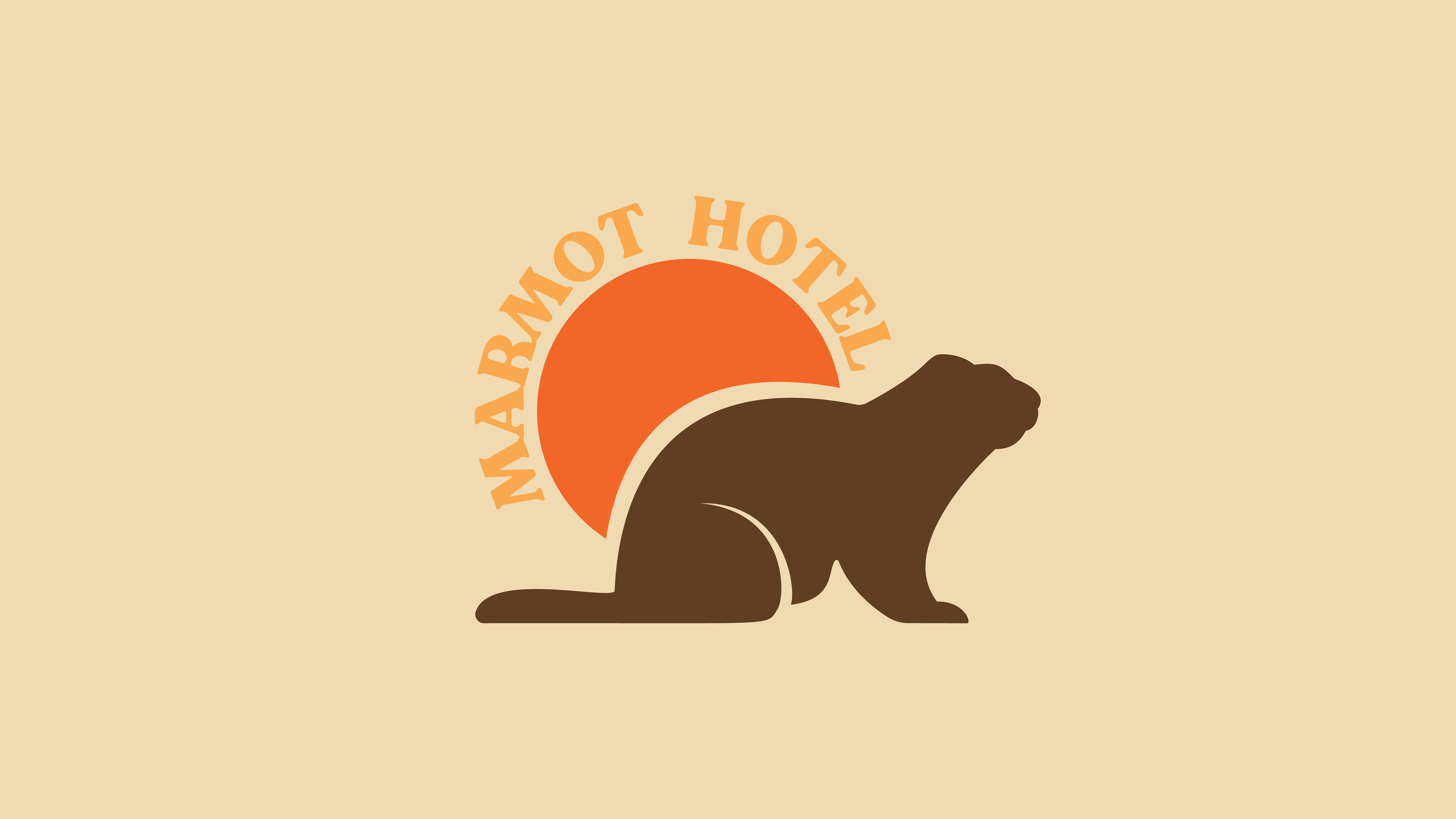
Above are the first renditions of the brand logo. The initial designs included multiple typefaces as well as a hand drawn marmot icon. I decided to move forward with the marmot icon as it is a perfect representation of the brand's image and aesthetic. The logo must be clean and professional yet retro.
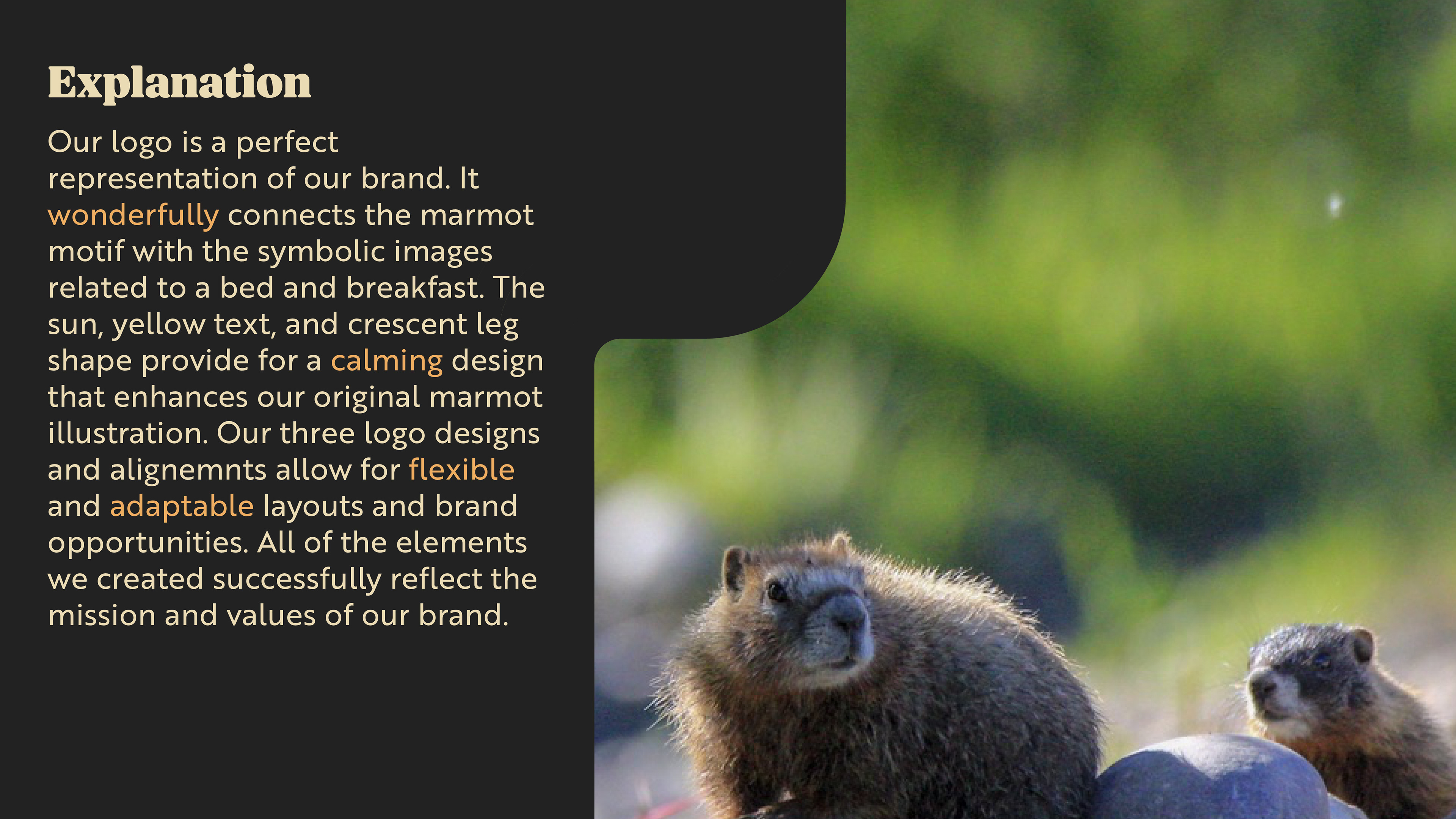
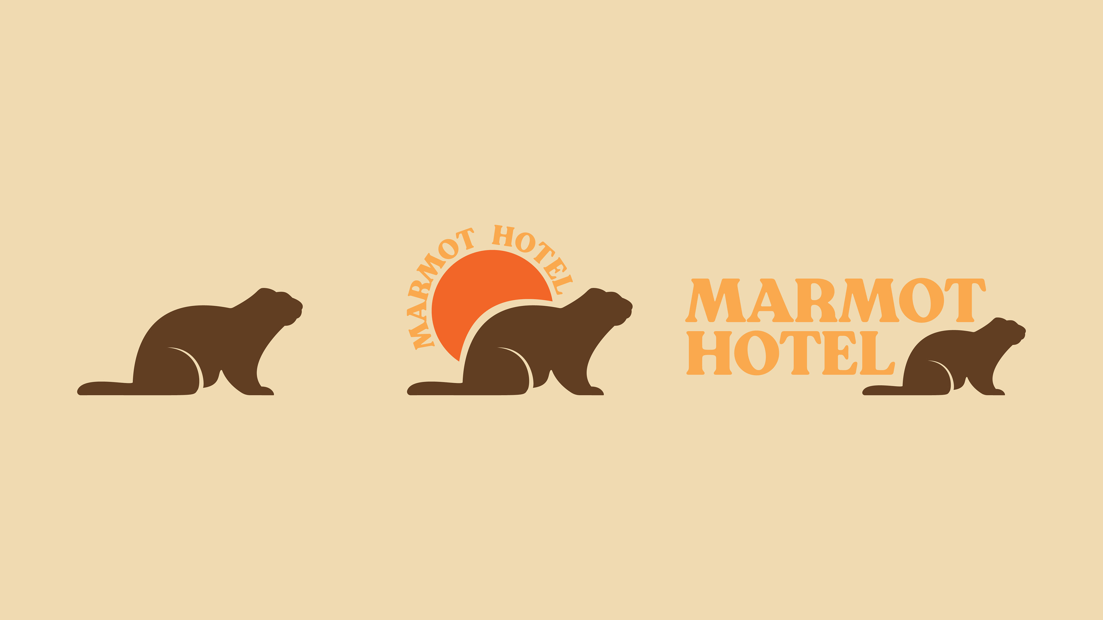
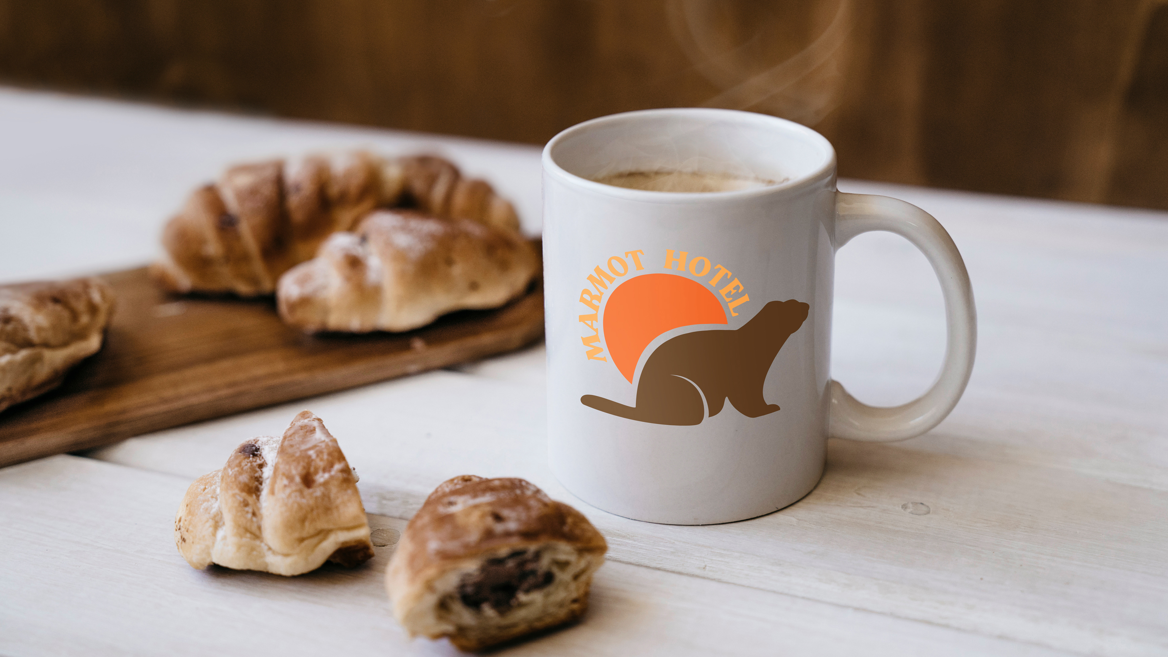
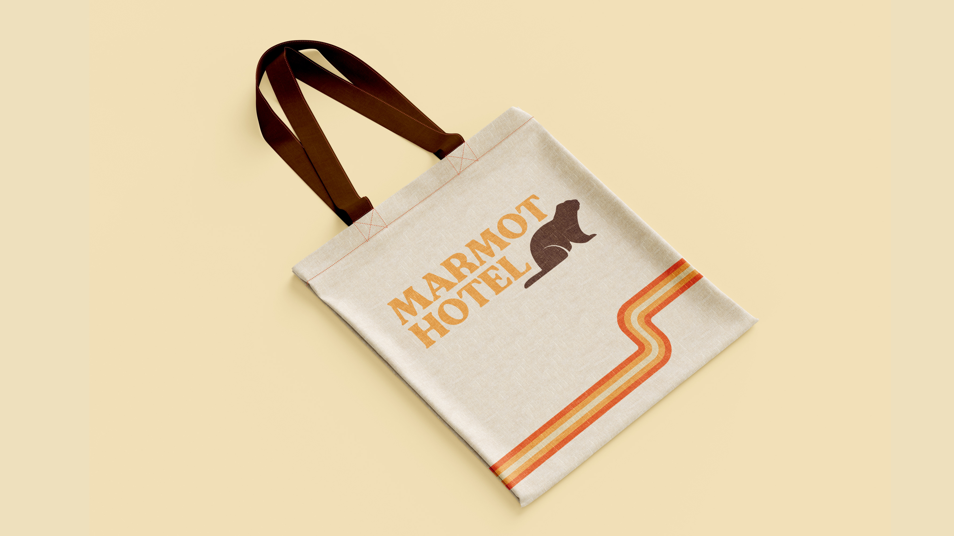
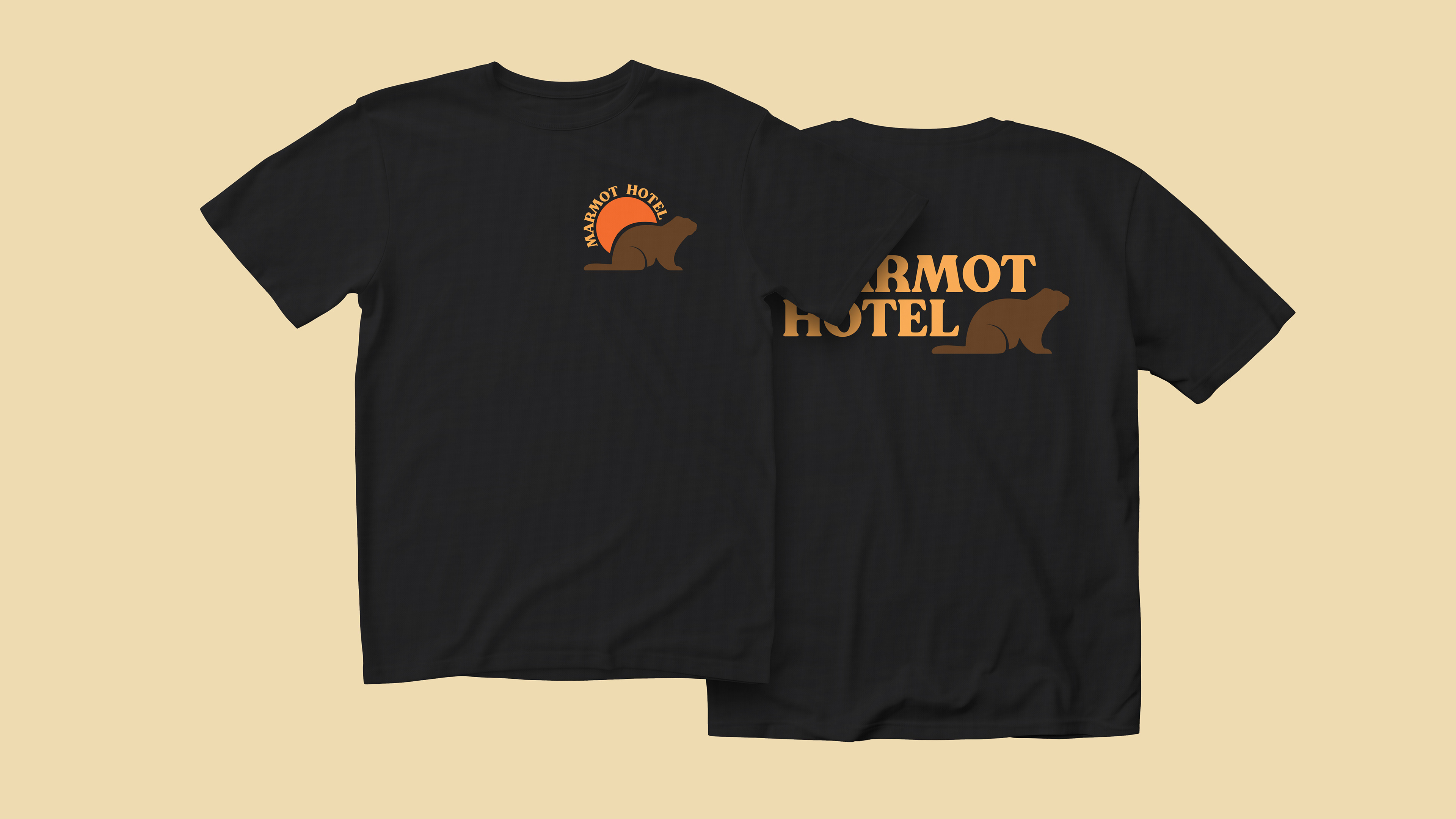
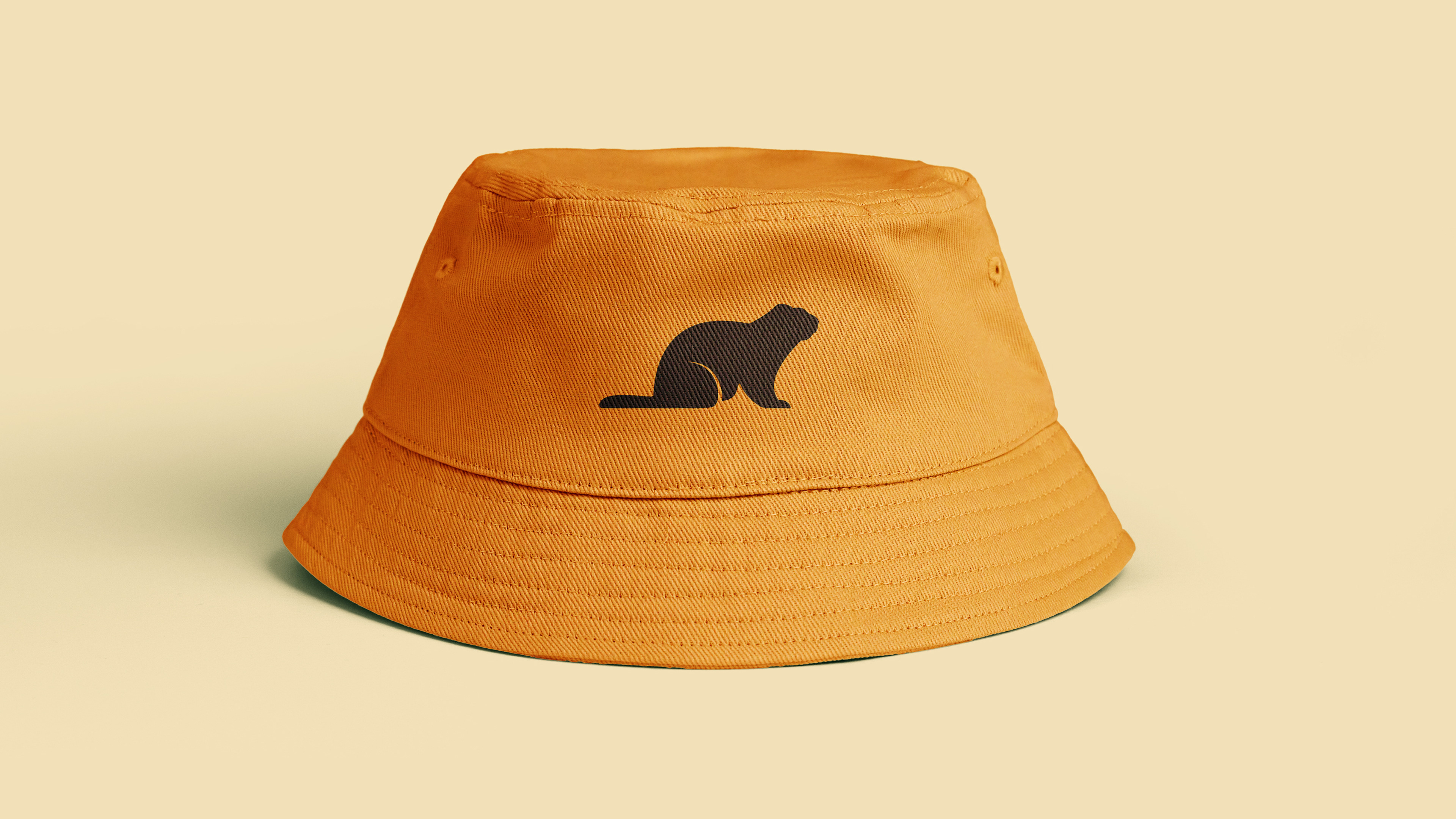
Shown above are the final three logo designs. The marmot Icon can be a stand alone image used in merchandise or promotional materials. The center icon with the sun and brand typeface is the primary logo. Finally, the third icon is a flexible and adaptive logo that can be used in websites and advertisements.
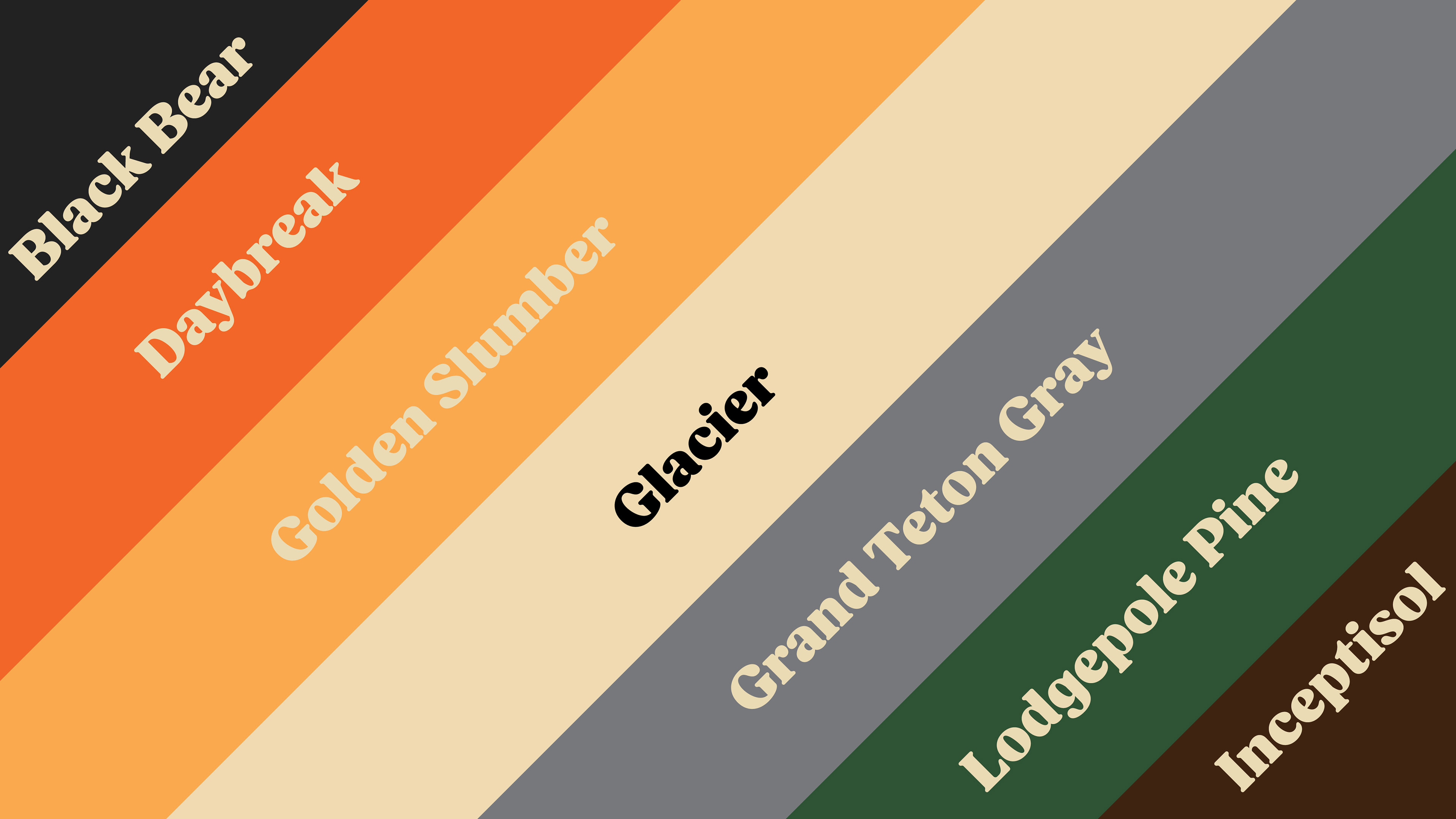
These are the company colors. Black bear, daybreak, golden slumber, and glazier are the primary brand colors with grand teton gray, lodgepole pine, and inceptisol being the secondary colors. All of these have corresponding hex code and pantone numbers.
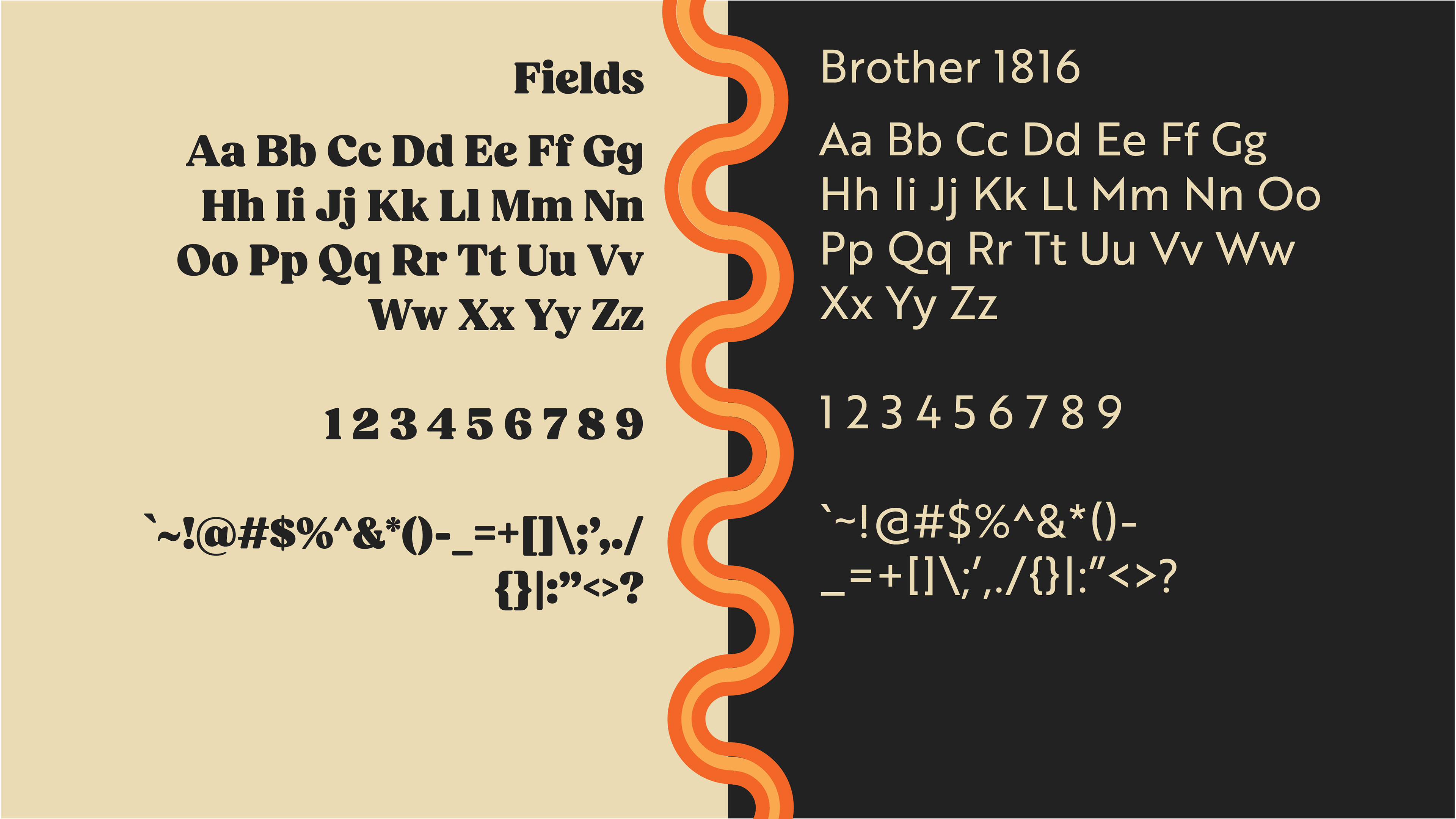
The typefaces above are the official brand fonts. "Fields" is to be used for headers and titles. "Brother 1816" is to be used for body copy. "Fields" is a traditional and classic feeling serif typeface that has smooth rounded edges that gives it an inviting and comfortable aesthetic. Adding "Brother 1816" makes the brand feel more modern and timeless.
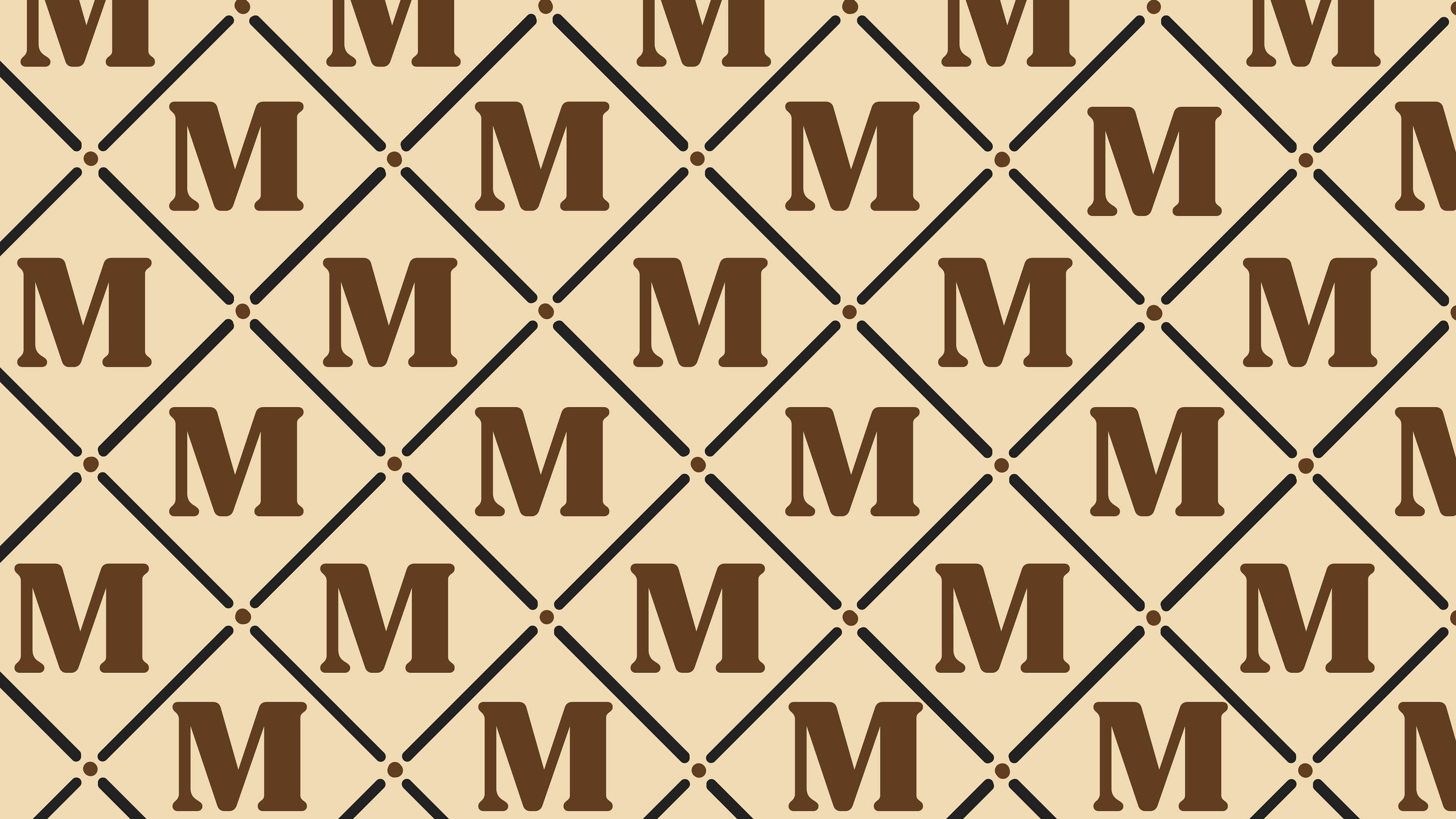

Above are two optional brand patterns the client can use in different unique situations.